We humans are primarily visually-driven creatures. Most of our decisions rely on what we perceive. Although, we might not be consciously aware of it. The internet, as you may have noticed, is an explosion of colors. You will find different websites employing all sorts of backgrounds and color schemes to entice the viewer to keep on scrolling. And considering the rise of internet dependency, one could say that websites have achieved their goal.
Certainly, at TextureX, we have done our best in building a visually appealing and professionally designed website for our clients and general audience. We love all forms of textures (as you can only imagine! :), because the possibilities and potential illustrations are timeless.
Perhaps, you may have already noticed this. But, a lot of websites (targeted to the same audience, more or less) utilize almost an identical color palette. This is no accident nor is it an attempt to imitate successful websites. You probably know by now that color schemes play a pivotal role in effective web design.
It is more than just a superficial visual appeal.
A strong color scheme can inspire your audience to feel a certain way when they visit your website. It could evoke certain ideas and bring out emotions the moment they arrive on your web page. An effective color scheme is subtle but memorable, muted but also vivid.
For a website to achieve the perfect color scheme, there are certain considerations you should remember.
Understand the basics of color theory
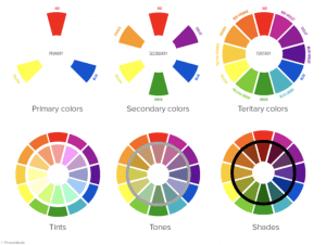
The very first lesson you learn in art class is the color wheel.
The color wheel is the most fundamental idea of color theory. It establishes the primary, secondary, and tertiary colors as well as illustrate the relationship between them. More importantly, color theory allows you to create harmony in your design by helping you choose the most pleasing set of colors. A harmonious and well balanced color scheme can give your website a sense of order which will make navigating your site much easier on your audience.
While you do not need an in-depth study of color theory (and it is an incredibly extensive subject), it is important to take note what set of colors complement or contrast another. Choosing a color scheme will not be too complicated with the help of the color wheel.
Avoid using too many colors
Perhaps the most common mistake of first time web designers is choosing too many colors on a single page.It is an understandable enough misconception. Colors draw attention and different colors evoke different emotions and ideas. So, why shouldn’t you make use of an assortment of colors to achieve your targeted effect? The answer is that you would be overloading your website with color, effectively making your site off-putting for your audience.
The trick is to be careful and restrained in your color choices.
Also, be sure to use a lot of white on your web design too. You do not need to utilize so many colors and shades to get attention. Too many can make your audience confused. A clean and simple color scheme can win over an audience much better.
Consider color symbolisms
Certain colors are linked to certain perceptions or emotions.
Colors affect people on an emotional level and it is wise to understand the
psychology behind the different colors and their impact on your audience. For instance, companies that want to elicit excitement or passion for their brand use red. Then for balance and professionalism, they use black and white.Green is for companies or brands that focus on the environment. Meanwhile, blue is the most commonly used color since it is linked to a sense of calm and authority.
There are countless color symbolisms out there. Consider the goals and services of your website. What do you want people to feel about your website? What ideas do you want people to associate with your website? Do your clients want their websites to remind them of nature? Or being in the outdoors? Or of traveling? These symbolisms do have a profounds effect in the look and feel of the site.
The 60-30-10 rule
There is no definitive answer to the question of how many colors you should choose for your color scheme. It all depends on a number of variables. However, one thing that most designers agree is that you need three different colors for the three main elements of your design and those are the background, base, and accent.The background is the primary color that establishes the general theme of your website.
It is the most used color (60%) in your page and needs to be selected carefully. The base (30%) should contrast the background color since it will be the color that divides your website into sections, as well as create visual interest. Lastly, the accent (10%) is the color that will give your page personality. It is the least used color and is dedicated for the really important areas of your website.
Text and background must contrast
Lastly, you should never neglect the color of the text of your website and how it will look alongside your background and color scheme.What you want is for the text to contrast with your background so that it will be easy to read and distinguish from your design. If your background is a bright color, choose a dark color for your text, and vice versa.
Readability is crucial for websites, especially ones that are text-heavy. You do not want your audience to strain to read the text on your page. It will discourage them from visiting your website again.
Conclusion
One of the most important aspects of an effective web design is the right color scheme. The layout of your page as well as the font style and color rely on your choice of color scheme. Colors are extremely powerful and can motivate an audience to engage with your website. How you utilize your color scheme can even strengthen your brand identity, which is especially important if you are engaged in ecommerce.Web designers need to take every little detail into consideration. Color is not just for visual design. It can also convey the message of your brand and evoke a lasting impression on your audience. That is why it is important to choose the optimal color scheme for your website.
Getting the perfect color scheme might be tricky if you are a beginner but with diligent study and a little experimentation, you will be able to find the most effective color scheme for your website.
